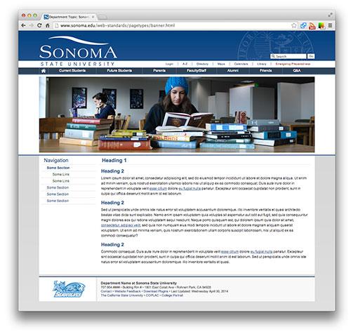
The official website of Sonoma State University will be getting a long overdue redesign into a sleeker, more dynamic website with additional features replacing the current website, which hasn’t been updated in six years.
This project has been in the works since 2015 and it will create a much different online profile for the university.
The design, which features more photographs and color, was created with a priority on prospective students. Therefore, the home page will be for showcasing the university. This is apparent right away; at the very top of the page there is a beautiful video, shot by drone of the Sonoma State library. There will be more high-resolution videos such as this one, perhaps of students walking to class or of a basketball game, with the goal of showing people what it’s like to attend Sonoma State.
Sandy Destiny, director of creative services for Sonoma State, is the one who originally decided to do this project.
“The homepage used to be kind of like a newspaper,” said Destiny. “It has now been redesigned to be for prospective students. Most students, when they come to the homepage, all they want to do is click ‘Login’.”
Sonoma State paid about $120,000 for them to do the redesign. The website was originally planned to debut on Feb. 28, but it’s being pushed back and its unveiling has not been determined.
New features include student testimony about the school, videos of the campus, links to majors, a social media grid and fun facts about Sonoma State. The News Center has been pushed down the homepage and is no longer the first thing visitors will see when they go to the website.
Seawolf Calendar is an aspect of the website that will become more interactive and user-friendly. Users will be able to purchase tickets and find information you need about events.
“We want it to be warm. We want it to be welcoming and we want it to invite you to explore our campus,” Destiny said.
One of the biggest changes of the site will be responsive to the device you are using. Whether you are on your phone, tablet or computer, the site will rewrap so it can be easily read.
The website will also experience a major upgrade in the technologyit uses. By using a more modern, up-to-date system, the site will be more data-friendly.
A new platform for managing content will allow for the website to serve as a database where only the information visitors actually need is displayed. Also, the redesigned website will be more accessible for people with disabilities, which was a driving force behind the upgrade.
Future website upgrades should focus on “making things easier for people to find, making it easier to update things, and those kinds of things,” says Laura Krier, the web services librarian. The library’s website will remain the same for the time being, but it will eventually transfer over to the new design and server.
This is the case for most of the web pages that are currently in use. The pages that will be initially affected are the homepage, admissions, news and the calendar. All other pages will stay the same, but the process of transitioning them over has started.
“Nowadays you should be updating it every two years because people get tired of looking at the same thing, and you need to refresh it,” said Destiny.
The new site was designed by Kwall, a web design company that took the consultation of the web and marketing committee and developed it into what viewers now see when they visit sonoma.edu.


